

Bianca Levan
Hand-cut Paper Art
BRANDING + PRINT + WEB DESIGN
Bianca is a visual artist based in San Francisco, specializing in the intricate and delicate art of paper-cutting. Transitioning from a corporate career to pursue her artistic passion, Bianca has established her own studio, gaining recognition from both local and national galleries for her unique artistic practice.
Bianca reached out to me to work on her new branding and an engaging website that would serve as a comprehensive digital portfolio. Additionally, the design extended to digital and print materials to enhance Bianca's representation in galleries, ensuring a consistent and captivating showcase of her unique paper-cutting art across various mediums.

Moodboard photos: Usplash, Bianca Levan, Takumi Documentary
Visual Direction: Precision, Light, Texture
This moodboard unfolds the story of an artist who invites us into her creative journey. She is a storyteller, revealing the depths of the unconscious and the language of symbols. Each element becomes a point on a visual map, holding our gaze. To truly understand, we must give it time—allowing ourselves to sink into the process, to follow the emotions as they rise and shift.
The photography captures both the artistic gesture and the quiet precision of choice. Guided by intuition and grounded in a strong foundation of design principles, the artist shapes her work with care. The atmosphere emerges through images of black papercuts, the delicate grain of paper, and its subtle glow as each piece takes form—bathed in the soft sunlight of her studio.
Warmth, Texture, Nuance
The colour palette is built around Light Metropolitan as a neutral shade, reminiscent of natural paper tones. The primary hue, Old Paper, harmonizes beautifully with skin tones to evoke the bodily and tactile essence of Bianca’s creations. Together, they create a warm and inviting atmosphere—an intentional departure from the stark white backgrounds often seen in artistic portfolios.
Instead of a cold, flat black, the palette features a deep, warm Charcoal, inspired by the drawing charcoal Bianca uses in her sketches. Like the black paper in her works, it is never purely black, but alive with subtle depth and nuance when seen up close.


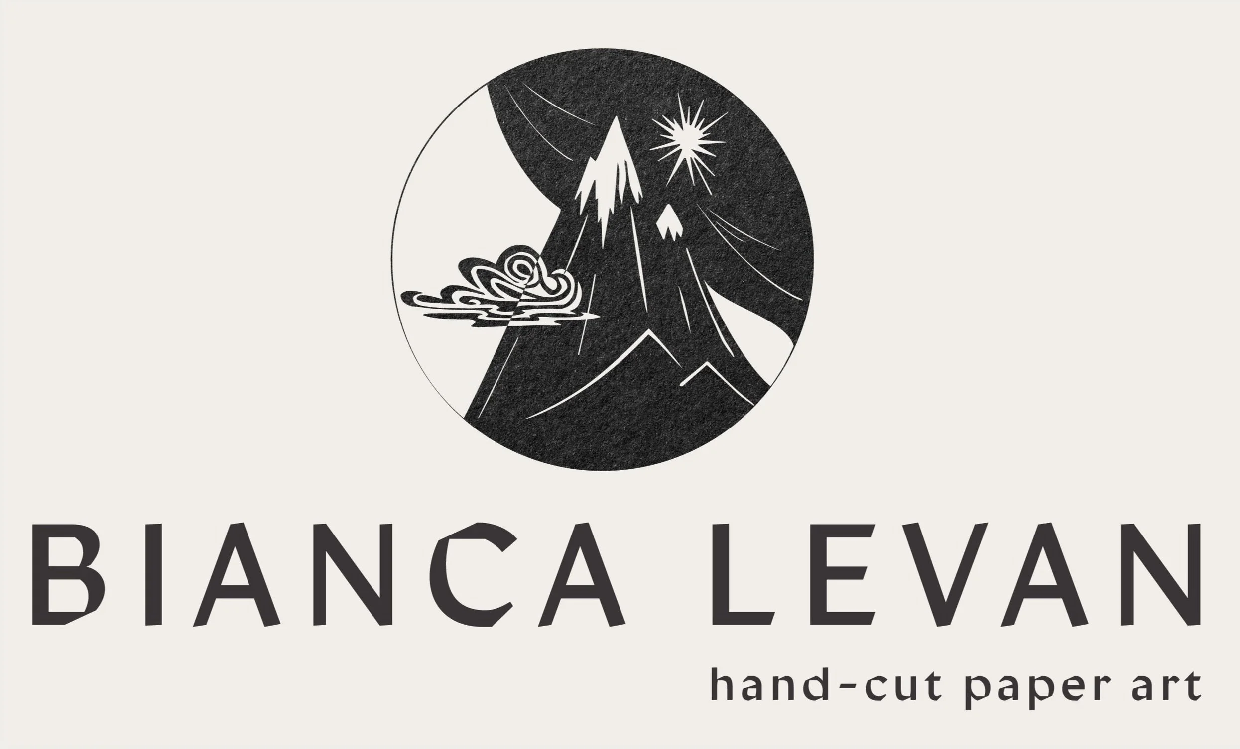
Papercut logo
Bianca’s logo draws directly from the elements of her artwork, offering an immediate sense of her visual language and inviting us into her artistic world. The mountain, a recurring motif in her creations, carries strong symbolic meaning—standing for strength, grounding, and the cycles of transformation.
The design embraces duality, reflecting the interplay of day and night, light and shadow, and the continuous rhythm of life that runs through Bianca’s work. Alongside the main stacked version, a horizontal variation features the logo icon paired with a submark of the artist’s initials and an oak twig with leaves, another emblem drawn from Bianca’s artistic universe.


Typography


Print Design


Website designed with new branding, comprised of 7 pages with the main focus on Bianca’s reach portfolio presentation, events and large About page. The individual works in portfolio are also linked to the shop, if they are available for sale.
You can visit Bianca’s website and see my branding application here.
Web design


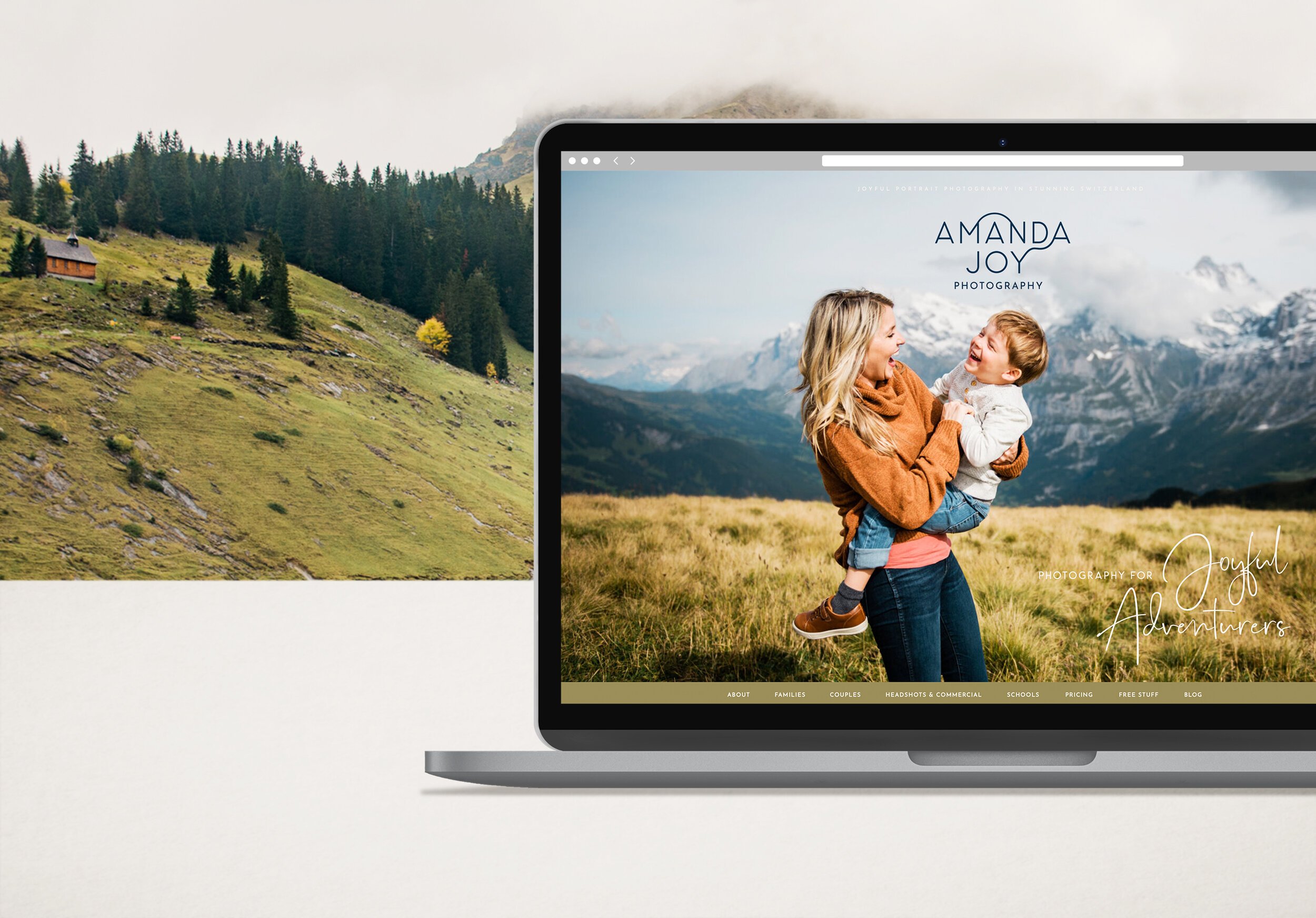
Rebranding for a Family Photographer

Körperkultur - Branding for a women club

Branding for nutritionist Tessa Holi